Why You Need to Start With the Perfect Interface
Getting your component interface right is the most important thing.
And you can't leave it for later.
You have to get it right from the very start.
But why is this so important?
Why is it important to get right?
An interface is like a contract that your component makes with whoever is using it.
If you give me these inputs, these are what the outputs will be. Or in Vue terms, if you give me these props, this is what will be rendered.
As your beautifully written component is used more and more, you have more places that rely on this component. They're expecting that it will do what it says it will.
It may only be 2 other components that rely on it. But it may be hundreds if the component is part of a component library.
So how do things go wrong?
If you break the contract that's defined by your component's interface, you'll break anything that relies on your component.
This is obviously bad!
You need to keep that interface consistent to avoid those headaches.
And if you keep the interface the same -- the props and slots, and what the component renders -- you can change how it all works internally and keep your promises. You can refactor and rewrite the internals of the component, and no one else cares.
Getting the interface right is a lot of pressure when you're writing your brand new component!

But you don't have to stress out over this.
Okay, maybe not perfect
The amount you need to worry about this is based on how much the component will be used.
If it's going to be used in only 2 spots, it's not as painful if you make mistakes. But if Vuetify gets an interface wrong, that's a completely different story.
Most people don't think about the interface enough.
And that's why I'm stressing this so much.
So spend more time getting the interface right!
Let's see how we can do that.
Start with your ideal interface
It's a pretty simple trick, really.
Instead of just jumping in and writing the component, you take a step back to think.
Simple, but not always easy!
You need to think about what it is that you want to build. Then you dream up the perfect way it should be used. You have to imagine you're in a magical world where anything can come true.
In a perfect world...
...wouldn't it be amazing if Git never had any merge conflicts?
...or if your code worked flawlessly on the first try?
In my perfect world Internet Explorer would no longer exist! (We're getting there slowly but surely).

But we're talking about Vue components here, so let's get on with it.
Guidelines for Creating the Ideal Interface
As we're dreaming up our ideal interface, there are a few things we'll want to keep in mind:
- Trust yourself. You're a developer, and you work with interfaces all day. Trust your intuition here.
- Don't worry about implementation -- yet. We can ignore implementation for now. Sometimes as we implement a component we realize we need to tweak our interface, and that's perfectly fine.
- Use a physical metaphor. Radio buttons, toggles, and other UI elements borrow from the physical world. This is a great idea because these are concepts that have been proven over many years. They're also familiar to almost everyone.
- Keep it simple. As is the case in almost every area of life, the simpler the better.
So let's just jump in and see what this might look like with a few different components!
Radio Button Group
We'll start off with something most of you are familiar with.
If we wanted to build our own Radio and RadioGroup components, what would we need?
Our basic requirements would look something like this:
- A
Radiocan be toggled on and off - Each
Radiohas a label - We can group multiple
Radiocomponents together - Only one
Radioin a group can be toggled on at a time
Let's start with what a Radio component could look like:
Seems straightforward so far, so let's look at what a bunch of Radio components in a RadioGroup might look like for selecting t-shirt sizes. We'll restrict the options to Small, Medium, or Large:
Not too bad!

But right now we have no way of knowing what radio button was clicked, or setting a default selected value. The easiest way to do that would be by adding a v-model to it:
Then when the user clicks on a Radio component, it will update the value of shirtSize in our SelectShirt component.
Seems like a pretty solid interface!

When we go to actually write this component, we may find things don't work out the way we had thought. But that's all part of the process.
You should expect to iterate on the design and slowly refine it.
Like sculpting a statue out of a slab of marble.
Media Object
A Media Object is a pattern where you have an image, a header, and some text grouped together.

The most obvious way to create an interface for this component is this:
But let's look at the prop names and see if we can do better.
To specify the image we have image. But would it make more sense to have it be src instead? This would make it more consistent with the <img> tag we already have in HTML.
We could even change title to be heading. I'm not sure which would be more intuitive though 🤔.
The prop description could even be changed to text if you wanted.
As you can see, even something that seems as simple as prop names can be difficult to figure out!

You could also make this component far more composable using slots. But we'll cover that in the next example.
Autocomplete
Our Autocomplete will need to be given a list of items, and then it will tell us which one is selected. Perhaps we would use it something like this:
Then the select event returns the item that was selected:
This will work pretty well, but only in cases where we know all possible values ahead of time. Things like selecting a car model, country, or favourite genre of music:
But maybe we will want our Autocomplete to be hooked up to an API so we can fetch that data dynamically. For this we'll have to do these steps:
- Get what is typed into the
Autocomplete - Send it to the API
- Get the list of results from the API
- Feed those results into the Autocomplete
We don't have to worry about how exactly this will work (just yet), but we know we'll need another event for when the user types:
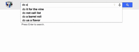
Awesome! This let's us do a dynamic search that updates as we type, like Google's autocomplete does:
And this is just one way of doing it. We could have the Autocomplete handle all of the logic of fetching results from the API if we wanted to.
Let's take this to the next level now:
What if we want to customize how each item is rendered in the Autocomplete?
We'll have to use slots for that, specifically scoped slots. Probably something that would look like this:
Like with the RadioGroup example, as we start to implement this Autocomplete we'll likely find places where we need to tweak our design.
Conclusion
Hopefully seeing this in action has helped you to understand how you can start with the perfect interface.
By stopping to think first, we can save ourselves -- and others -- a lot of time and headache.
If you learned something in this article, please share it with someone who would also love to learn!